



More Contextual Usage Analytics
1779361794003
What it does
Three updates to Usage Analytics give you a clearer picture of practice across your organization, and the context to do something about it.
Implementation against the 30+ benchmark. A new tab on the Overview page shows how student practice across your schools compares to the ESSA Tier III–backed recommendation of 30+ questions per week per subject. It defaults to your most-used subject, and you can switch subjects from the dashboard filter.
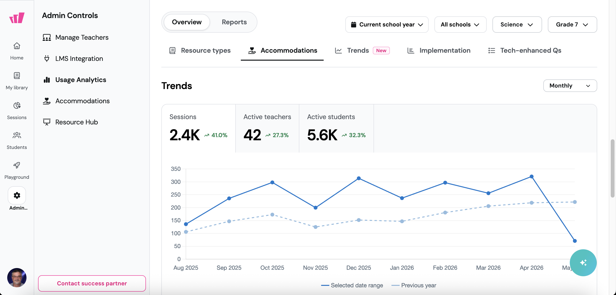
Trends over time. A new Trends tab shows trendlines for sessions, active teachers, and active students. Toggle between daily, weekly, and monthly granularity depending on whether you're tracking week-over-week movement or quarterly patterns.
Drill-downs from the tiles. Click a tile and a side panel opens with the underlying list of schools or teachers. The drill-downs respect whatever filters you have active — so filter by Grade 7 + Science, click Active Teachers, and you'll see exactly which teachers qualify.
How it works
Everything lives inside Usage Analytics in your admin dashboard. Nothing to enable.
Open Usage Analytics from your admin controls
Use the Overview tab to see implementation against the 30+ benchmark
Switch to Trends for sessions, active teachers, and active students over time
Click any drill-down-enabled tile to see the underlying list of schools or teachers
Apply dashboard filters (grade, subject, school) before drilling in to scope the list
Example in action
Your spring instructional review is two weeks out. You want to see how middle school science is using Wayground — which teachers are consistently active, which ones could use a check-in. You open Usage Analytics, filter by Grade 6-8 + Science, and the Implementation tab shows you where things stand against the recommended practice benchmark. Click the Active Teachers tile and the underlying list opens in a side panel. Your instructional coaches walk into their next PD cycle with a clear shortlist of teachers to support.
What did you think about this update?


Leave your name and email so that we can reply to you (both fields are optional):
